Ink/Stitch font creation
Warning : Some of the tools used here are not part of Ink/Stitch 3.2.2. This text is rather long, but it is best to read it entirely before diving into font creation.
The goal of this tutorial is to help you create a font usable by the Ink/Stitch lettering module starting from a ttf or otf font file. More than a step by step tutorial, this is meant for you to understand what is to be done and why.
What is a font for Ink/Stitch lettering?
The files that make up a lettering font are grouped in a font-specific folder, which resides in the Ink/Stitch fonts folder (for Ink/Stitch fonts) or in your personal font directory for your personal fonts.
Each font folder must contain at least two files:
- a font.json file that contains the font’s characteristics.
- at least one glyph layer svg file,that contains one layer per glyph. Most fonts in the lettering module are defined using a single glyph layer file, named →.svg.
This →.svg file is intended for left to right embroidery (the direction of the arrow).
The glyphs of an Arabic or Hebrew lettering font are defined in a ←.svg file.
Some fonts, such as Déja vu, contain both →.svg and ←.svg files. In this case, a multi-line text can be stitched back and forth: in the →.svg file, a letter is stitched from left to right, while in the ←.svg file, it is stitched from right to left. The lettering module will alternately use the two files on the different lines that make up a text.
These names are mandatory… unless the font contains a large number of glyphs, in which case, for a left to right font, you can distribute your glyphs across several svg files (there are no naming restrictions for these files) and regroup them together in a folder that must be named →.
The font folders in the lettering module also include:
- a preview.png file (usually 90x1100 px) containing the embroidered preview of the font name that appears in the lettering dialog.
- a LICENSE file, which provides information about the font’s LICENSE. For an embroidery font created from a TTF, OTF, or other font format to be legally integrated into the lettering module, the original font’s license must allow it. Please note that so-called commercial licenses generally do not allow integration into Ink/Stitch.
Font Choice
The choice of font and its size depend primarily on the type of font you wish to create: satin, running stitch, fill, or appliqué… A satin column can be neither too narrow (at least 1.5 mm wide is nice) nor too wide (more than 7 mm wide and there is a risk of brittleness, and beyond 12 mm many machines are unable to handle it). Therefore, letters with highly variable line thickness will be difficult to process as satin columns only. Serif fonts are more difficult to digitize than sans-serif fonts. For an appliqué font, on the other hand, you should look for a fairly wide font. The main factor in your choice, however, remains your interest in the font.
Symmetrically, if you are set on a particular font, the shape of the letters must be taken into account when choosing embroidery settings.
Creating the Glyph File
In addition to respecting naming conventions, any glyph file must:
- Contain one layer per glyph, and the layer containing glyph A must be named GlyphLayer-A.
- A guide named “baseline,” which corresponds to the line being written on. Ink/Stitch needs this guide for lettering along a path to work correctly.
- It may contain other elements.
Manually
It’s entirely possible to manually create a glyph file, but it’s rarely the best option.
From Embroidery Files
If you already have a set of embroidery files (one file per letter, in machine-readable or SVG format), you can use the letters-to-font extension to group all these glyphs into a single glyph file.
From a TTF or OTF font
In this case, you can use FontForge to create an SVG font file, then use Ink/Stitch to transform this file into a glyph layer file.
Creating the SVG font file with FontForge
TTF or OTF fonts generally contain a very large number of glyphs, and you probably don’t want to convert all of them to embroidery.
The first step will therefore be
Selecting the glyphs
You need to delete from the font all the glyphs that you don’t want to convert into embroidery.
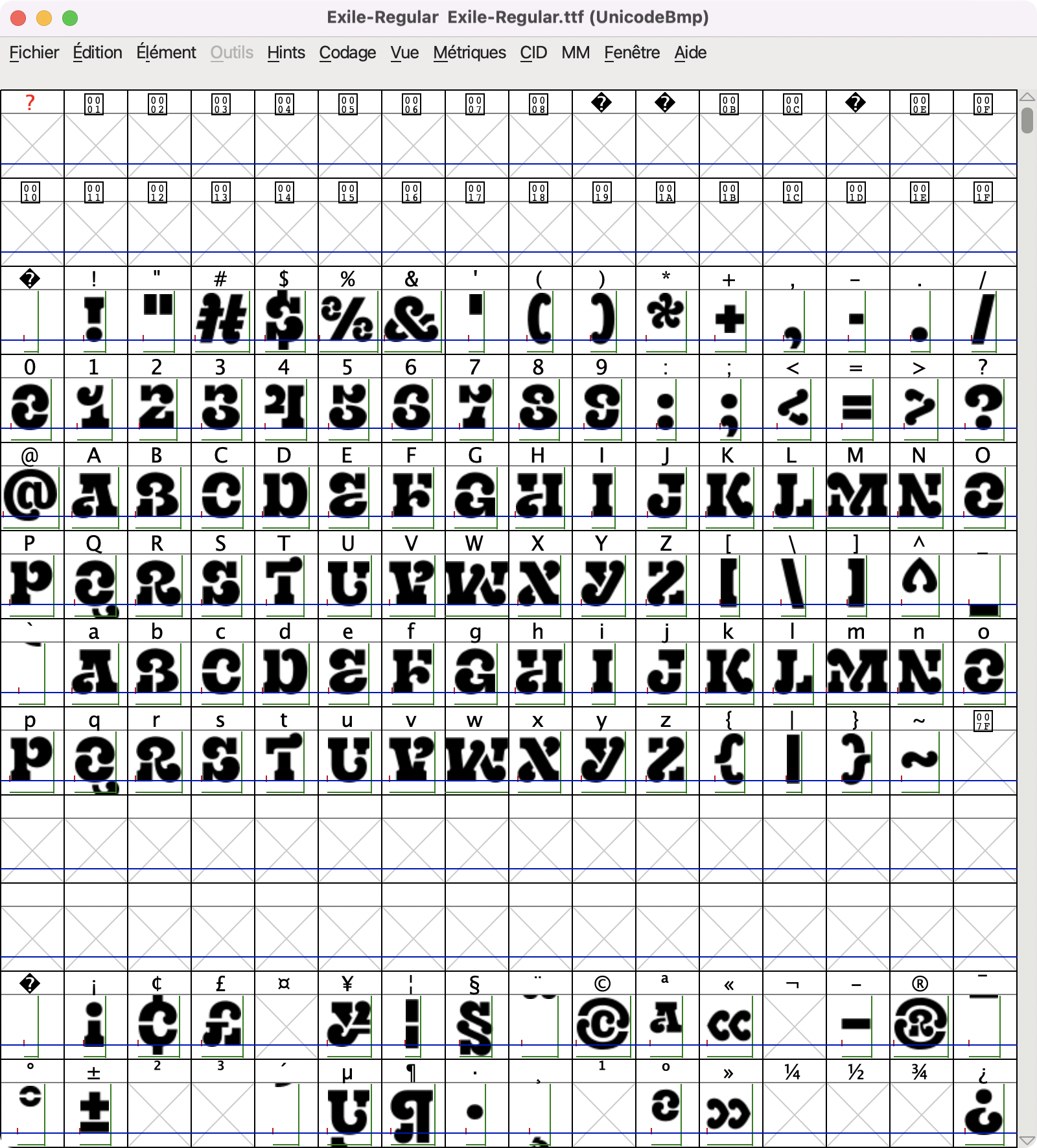
Open the font file using FontForge to obtain:
First solution: Select all the glyphs you want to keep, then Edit > Select > Invert the selection followed by Edit > Clear.
If yo don’t know where the glyphs you want to keep are, it may be useful to proceed as follows:
Choose Elements > Font Info > Unicode Range from the menus to obtain this type of information:
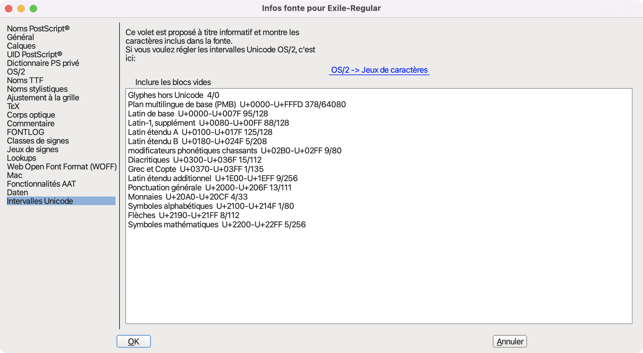 Clicking on a Unicode range in the list, selects all the glyphs in the range.
It’s not uncommon to be able to delete or keep all the glyphs in the range.
Clicking on a Unicode range in the list, selects all the glyphs in the range.
It’s not uncommon to be able to delete or keep all the glyphs in the range.
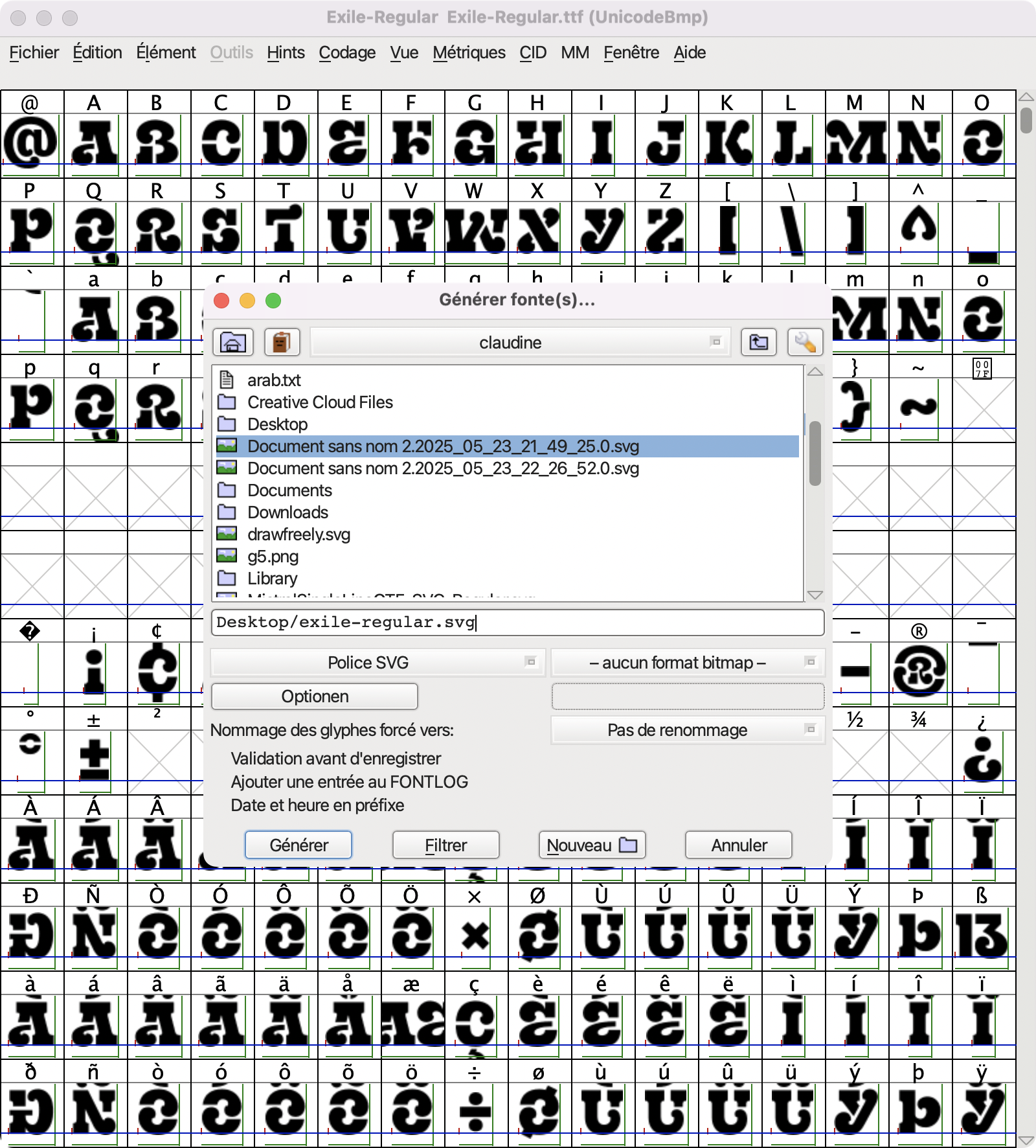
Once you’ve deleted all the unwanted glyphs, all that’s left for you to do is to go to ‘File > Generate Font’, select the “svg font” type, and click ‘Generate’.
Converting the SVG font file into a glyph layers file
Open the resulting SVG file in Inkscape. It looks completely empty, which is normal.
Extensions > Ink/Stitch > Font Management > Convert SVG font to glyph layers
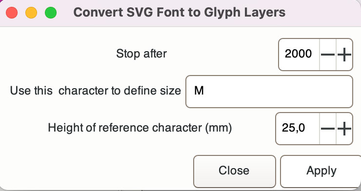
Choose a number of glyphs greater than the number of glyphs in your font, unless you’re in the testing phase and want to limit the number of glyphs.
This is the time to decide what size you want your font to be.
To do this, choose a reference letter that you know is in your SVG font (M is a common reference) and decide on its desired height.
Click ‘Apply’.
This will be the value for the “size” info in the json file
Your file is then converted into a glyph layer file; you now have many layers.
In addition to the “baseline” guide, other guides have been added. It’s a good idea to lock them so you can work on this file later without moving them.
The paths in this file have undefine stroke and fill colors. Select all paths in all layers (if your Inkscape preferences don’t allow the selection of hidden objects, you’ll need to show all objects to do this), give them a fill color, and specify that there’s no stroke color (or specify a stroke color and specify that there’s no background color). You can hide the layers again.
If you want to create a left to right font, save this file as →.svg in a new folder located in your personal fonts folder.
Creating the font.json file
Once the →.svg file exists, you can create the associated font.json file. It is recommended that you do so as early as just now.
Extensions > Ink/Stitch > Font Management > Generate JSON....
This extension will extract information from the →.svg file and store it in a font.json file. The extension’s dialog also allows you to add information. The documentation is here.
You will be able to modify this information later using Extensions > Ink/Stitch > Font Management > Edit JSON File....
The documentation is there.
What is kerning and how does it work?
This section is for the curious; it can be skipped at least initially.
Where is the information?
The font.json file contains the kerning information. It was extracted from the →.svg file when the font.json file was created. This information will greatly contribute to the positioning of the glyphs relative to each other.
To determine a glyph’s position, Ink/Stitch uses three types of information:
- Moving a glyph horizontally or vertically within its layer affects its position (except for the very first character of a line of text, which is systematically on the left side of the page (at least with left-aligned lines). Vertical movement is always taken into account.
- “horiz_adv_x” information. There is a default value, and a value can be assigned to each glyph. The font file generated by FontForge includes this information for all glyphs that have not been deleted. This information is integrated into the font.json file when it is created.
- “hkern” information. This information is not associated with glyphs but with pairs of glyphs (not all of them). The font file generated by FontForge includes this information for all glyph pairs for which the TTF or OTF font designer provided this information, whether the glyphs were deleted or not. This information is integrated into the font.json file when it is created.
How does it work, schematically?
Ink/Stitch breaks down a text into lines, a line into words, and a word into glyphs.
Let’s say we want to embroider the word Test. We assume left alignment, and here we’re talking about the horizontal position. The left side of the page is at x=0
- At the beginning of the line, the cursor is at 0, the first character “T” is drawn starting at x=0
- Before drawing the next glyph the cursor is
- advanced by the horiz_adv_x value associated with T (its own value if it exists, otherwise the default value)
- if the drawing of the e begins slightly before the left edge of the page, the cursor is moved back by that amount; if it begins after that, the cursor is moved forward
- if there is an hkern value for the “Te” pair, the cursor is shifted by that amount (a positive value decreases the distance a negative value increases it)
….and so on for all the letters in the word
How to fix a possible kerning problem
If you notice a kerning problem with a particular glyph while using the font:
- Check that the glyph is correctly placed in its layer; it may have been accidentally moved.
- If the problem occurs with most other glyphs, you need to modify the horiz_adv_x value for that glyph.
- If the problem only occurs with a few other glyphs, you need to modify (or add) the hkern values for the affected glyph pairs.
These last two operations are performed using the extension:
Extensions > Ink/Stitch > Font Management > Edit JSON File
Check that everything is working correctly
If you’ve created these two files and they’re in a folder in your personal fonts folder, your font will now appear in the lettering module. The stitching for each letter is configured as an automatic fill (if you’ve set a fill color for each glyph) or as a straight stitch (if you’ve set an outline color for each glyph). It’s still too early for actual, high-quality stitching, but everything should be working.
You can also use
Extensions > Ink/Stitch > Font Management > Font Sampling to view all the glyphs of your font. See documentation.
At any time, Font Sampling will allow you to view all the unlocked glyphs in your glyph layer file.
Creating a truly embroiderable font
Now you need to transform letters designed to be printed to letters ready for embroidery.
Each letter is a small embroidery in itself, and all the usual embroidery issues apply.
It is highly recommended to fully process a few letters, for example, A, H, M, G, o, a, p, to have letters with quite different designs, and to check that everything goes well during embroidery.
This is a good time to decide, for example, how to process the edges of a satin column font.
Answering this question early will allow you to apply the same approach to all the edges of the font.
What parameters seem most suitable to you, for example, what density, what compensation?
Don’t worry too much about the parameters, it is easy at any time s to standardize the settings and change them globally for the entire font.
In addition to the usual concerns, working with a font involves a few unique ones.
Jump stitches and lock stitches.
Use them sparingly
Generally, several letters will be embroidered at a time, and you’ll want as few jumps and lock stitches as possible. Often, a good routing allows for the embroidery of a connected letter without any jump. Of course, if the letter is disconnected (for example, due to an accent) or between two letters, jumps may be necessary, but it’s up to you to ensure there are as few as possible.
Before and after each jump, the machine makes lock stiches, which slows it down and also tends to distort the embroidery. Therefore, avoid them as much as possible.
If the font is to be integrated with Ink/Stitch, keep in mind that not everyone has a machine that trims the threads, so avoid large movements between two letters, especially if the machine is going to embroider over them.
Often, we start a letter at the bottom left and end it at the bottom right precisely to avoid this.
If you’re not familiar with the concepts of lock stitches and jump stitches, the documentation is here.
If your font uses satin columns, try to ensure that the ties are not located at the tips of the satin columns, as that’s where they are most visible. You can use an end position command on a satin column to force the lock stitches position.
But use enough of them.
It’s also important to keep in mind that many users like to cut the jump threads between letters or between the body of a letter and its accent. For safe trimming, the jump must be a true jump in the Ink/Stitch sense, i.e., long enough to befollowed and preceded by lock stitches. This is particularly true when the jump follows an actual part of the letter (for example, a satin column), and maybe not so necessary for a jump between two underpaths (for example, an underpath in the body of the letter followed after the jump by an underpath in an accent).
Extensions > Ink/Stitch > Font Management > Force Breakpoints simplifies the process.
In particular,for satin column fonts made up of detached letters, it is possible to force lockstitches on the last satin column of each glyph.
To manage lockstitch for accents, it is possible to group all the the elements of accents in a group and then force lockstitches on the last element of each group.
The documentation can be found here.
Alternatively, you can use the minimum jump stitch length parameter locally to ensure the presence of lockstitches.
Trims
Ink/Stitch lettering allows users to add trims after each letter, word, or line if they wish. Therefore, the only place where it might be useful to add them is within a letter, when it is composed of several pieces.
Letters with Diacritics
Ink/Stitch users come from many countries and speak many languages, which is why it’s desirable for Ink/Stitch fonts to include something to satisfy as many people as possible. While not aiming for universality, adding letters with diacritics allows for a greater number of users.
Extensions > Ink/Stitch > Font Management > Fill Composite Glyphs helps you organize your work to avoid repeating the same digitizing task.
This extension also allows for some other optimizations.
The fill composite glyphs extension
The goal of this extension is to help font digitizers organize their work step by step.
At each step, a group of glyphs is placed at the top of the object stack, and the font creator must digitize these glyphs before moving on to the next step.
The steps are organized to divide the work into smaller chunks and maximize the reuse of already digitized letters.
You really need to test what you do at a step because it will be copied for other letters, and you want to avoid having to correct the same mistake multiple times:
Use font sampling to generate a file with all unlocked letters
- run trouble shooting and correct all detected errors
- Use simulation to detect unwanted jumps. Best done with the letters enlarged as much as allowed
- Realistic preview can help you find mistakes
- But real stitchouts are the ultimate test
Step 1
The code silently removes unwanted layers (e.g., empty paths, or no paths at all).
At this step, you only need to digitize comma, hyphen, and period.
Step 2
At this step, you need to digitize all the letters that have been grouped into the three groups: Uppercase, Lowercase, and Other.
For innstannce, you’ll find a copy of the period in the i and j glyphs; it’s up to you to decide if this is useful to you.
Only sinple letters need to be digitized (no accented letters in these groups).
Step 3
At this step, you need to digitize numbers, symbols, and some punctuation.
You’ll find pieces of some glyphs already included, for example, in the “;” you’ll find the “.” and the “,” as digitized in step 1.
It’s up to you to position them correctly or delete them. Also, the “1” contains the “l” and the “I.” If they’re too different from the “1” to be useful, delete them.
Step 4
Last part of punctuation : creating the closing punctuation using the opening punctuation.
For instance, You’ll find the “(“ in the “).” It’s up to you to return, position, and modify what needs to be modified.
Normally, at this stage, everything is pre-filled with your already done work.
Step 5
Apostrophes, Quotation Marks, and Single Accents
There are several types of apostrophes and quotation marks depending on the language used.
If you have created at least one, the extension adds the others here.
The same goes for quotation marks. Normally, there’s nothing to do for them.
At this step, you must digitize single accents; when possible, they are pre-filled with an equivalent symbol that has already been processed.
In the worst case, the accent is used by letters in the font, but is absent from the font. In this case, a letter that uses it has been inserted into its layer so that you know what to digitize.
Don’t forget to remove the unnecessary parts !
Step 6*
Complex Accents:
In this step, you deal with the other diacritical marks.
These reuse work done at the previous step.
This complex accents are either double accennts or have same shape as a simple one but a different position .
The layers are pre-filled, but there is some positioning work to be done, which is why a letter using the accent has sometimes been added to indicate where to position the new accent.
Step 7
Letters with a single diacritic:
You will find their layer pre-filled with the letter and the diaccritic; it’s up to you to compose them to create the composite letter.
Step 8
Letters with two or more diacritics….. only if you chosed to include some of them.
You can also use this extension with any font file to
- check for duplicates
- organize the letters by category.
Note: yes, you can leave the letters grouped; it doesn’t affect the lettering tool
Ink/Stitch users
They do strange things sometimes. Some precautions to take include:
Avoiding problems due to unusual preference choices
Giving local values to the “minimum jump stitch length” and “minimum stitch length” parameters ensures that users won’t stitch your font with strange values.
Unwanted resizing
Users are expected to resize fonts within the lettering tool. The reality is sometimes different. A useful precaution for satin column lettering is to add a maximum stitch length.
Resizing Settings
The font creator must specify the possible resizing values for the font in the JSON file. This requires trial and error to determine what works.
In the case of a satin font, the most important thing is the column width.
Extensions > Ink/Stitch > Troubleshooting > Element Information allows you to find out the maximum and minimum stitch lengths for all embroidery elements.
From the Help tab, you can copy the results to the clipboard and then to a spreadsheet to sort and find your widest and narrowest columns. T hese values will help you decide on possible resizing options for your font. Sometimes there are just a few very wide satin columns in the whole font. In that case adding or moving rungs might help shrinking them.
Adding or Removing Glyphs
If you add or remove glyphs after creating the font files, you must run the Edit JSON File extension so that the glyph list is updated.
If the glyph was not in the file from which you generated the font.json file, you will have to modify the horiz_adv_x value of the glyph if it is not to be the default value.
For this reason, in case of doubt, it is better to initially include too many glyphs than not enough.
Multicolor Fonts
If you want the lettering result to be sortable by color, there are two things you need to do:
- specify this in the font.json file (either when creating it or by editing the file); the font must be declared as “sortable.”
- attach a color index to each path. In most cases (all letters have the same colors in the same order, all paths of a given color within a glyph are consecutive) you can display everything in all layers, choose one of the glyphs, select the first object to be stitched, select all objects of the same color (select same fill color or select same stroke color, or both sequentially) and assign them index one, then choose an object of the next color to stitch, select all objects of the same color, assign them index two, etc. In more complicated cases you will have to think a little more to determine the indexes.
- If you have commands in your file, or guide or texture, donn’t forget to give them the same color index as thar of the elements they are relevant to.
Limitations of the Lettering Tool
You can’t (yet) use all of Ink/Stitch’s features in the svg file; for example, clones, path effects, and gradients aren’t supported by Lettering.
You can’t (yet) write a font for every language in the world, but since Ink/Stitch 3.2.0, contextual variants of the Arabic alphabet are recognized.
A nice little extra
It’s possible to have multiglyph layers, not just for ligatures. For example, in the allegria55 font, there’s a GlyphLayer-Inkscape_logo that contains the Inkscape logo.